First things first, why is font selection important?. Well, the fonts for the title of the films are important because they need to have be readable in every screen that the film plays at. Also, the contrast should be high so everyone watching the film can notice the title. Title's are really important for films which is why choosing the best font is so important.
Since we're going to do a thriller film I had to do some research to see which fonts are better for these types of films. Sans serif fonts are the most popular ones, some examples of these fonts are:
- Futura
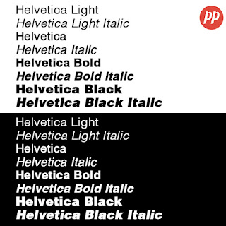
- Helvetica
- Gill Sans
These fonts are really popular/important because through these fonts we can get a feeling of drama, importance or boldness. I included some pictures of what the fonts look like so you guys could get a visual representation.
I think that choosing the right font for our film opening is really important. As of now, my teammates and I are going towards using the Helvetica font. We think that this matches the story that we're trying to show in our film. If anything changes I will let you guys know. Next week I will be posting more guys! Stay tuned!


No comments:
Post a Comment